A strong commercial realtor facebook Template should do more than make a property look attractive. It should help a broker communicate the property type, location, opportunity, key facts, and next action in a format that can be understood quickly on a busy social feed. Commercial real estate audiences often include business owners, investors, tenants, landlords, developers, and other brokers, so the design has to balance visual appeal with practical information.
The most useful templates are structured systems rather than isolated graphics. A good system can support new listings, leasing announcements, sold properties, market updates, investment opportunities, tenant-representation services, and local commercial insights while keeping the brokerage identity consistent. This consistency matters because repeated colors, typography, spacing, logo placement, and information hierarchy make individual posts recognizable as part of the same professional brand.
Current examples of commercial property social content show several recurring patterns: prominent property photography, a short status label, concise property information, strong contrast, clearly separated information blocks, and a direct next step. Real estate marketing resources also emphasize keeping page information complete, maintaining consistent branding, planning content, and responding to audience engagement rather than treating a social page as a static listing board. :contentReference[oaicite:0]{index=0}

What a commercial realtor facebook Template should accomplish
The central purpose of a commercial social template is information compression. A prospective tenant or investor should be able to understand what the property is, what opportunity is being presented, and what to do next without decoding a crowded graphic. That means the design should establish a visual order: status first, property image second, essential facts third, and contact or action information last.
Commercial properties also require different information from residential listings. An office property may need usable area, lease structure, parking, transit access, floor configuration, and tenant-improvement information. A retail property may need frontage, visibility, traffic patterns, signage potential, neighboring uses, and available square footage. An industrial property may require loading access, clear height, yard area, power, zoning, and distribution advantages.
A reusable template should therefore contain flexible content zones rather than rigid text. A headline field can change from “New Listing” to “Now Leasing,” while a property-information block can adapt to office, retail, industrial, medical, hospitality, or mixed-use assets. The visual identity remains stable while the information changes. This is one of the biggest advantages of using a template system instead of designing every post from the beginning.

Why commercial property posts need a different visual strategy
Commercial real estate is often evaluated through a combination of physical characteristics and business logic. A visually impressive building photograph may attract attention, but the audience also needs evidence that the property fits a particular business purpose. A template should make room for facts that help the viewer determine whether further research is worthwhile.
For example, an office post might lead with the building exterior and then present available area, parking, location, lease structure, and a short statement about the ideal tenant profile. A retail post can emphasize storefront visibility and access. An industrial post can make loading configuration, warehouse dimensions, yard characteristics, and transportation access more prominent. The template should serve the property rather than forcing every asset into an identical information pattern.
The best commercial graphics also avoid excessive text. The social image should communicate the main proposition while the caption can provide the deeper explanation. This creates two layers of information: a visual layer that stops scrolling and a written layer that answers practical questions. That approach is especially valuable when a broker wants to repurpose one listing across multiple social formats.

Essential sections to include in the template
A strong template normally begins with a status label. “New Listing,” “For Lease,” “Just Leased,” “Sold,” “Coming Soon,” “Price Adjustment,” and “Market Update” immediately tell viewers why the post matters. The label should be visually prominent but not so large that it competes with the property itself.
The second priority is the property identity. Include the property name or address, followed by the city or submarket. If the address is sensitive or intentionally omitted from public marketing, the design can use the building name and market area instead. The important point is that the viewer should know what asset the graphic represents without reading a long paragraph.
The third layer contains selected facts. A commercial graphic might show square footage, asking price, lease rate, lot size, property type, zoning, occupancy, or a few major features. Do not attempt to reproduce an entire offering memorandum inside a social graphic. Choose the facts that support the purpose of the post and direct readers toward the next step for additional information.
Property photography
Photography should normally receive the largest visual area because commercial real estate is strongly connected to physical space. Exterior photography establishes scale and architectural identity, while interior images help potential users understand condition, layout, finishes, and functionality. When several images are available, a controlled collage can provide more context without making the design feel crowded.
Avoid selecting images merely because they look dramatic. The strongest property photograph for social marketing is usually the one that explains something important about the asset. A wide exterior may communicate access and visibility. An aerial image may demonstrate site configuration. A warehouse interior may show clear span and storage capacity. An office interior may demonstrate natural light and the quality of the tenant environment.
Image quality should also be consistent. Mixing heavily processed photographs with dull snapshots can make the entire post appear less professional. If several property photographs are available, use a consistent treatment and reserve decorative elements for areas that do not interfere with the building itself.

Designing the information hierarchy
Information hierarchy determines what the viewer notices first, second, and third. A useful commercial template typically has three levels. The first level communicates the event or opportunity. The second identifies the property and its most important fact. The third provides supporting details and contact information.
Typography should reinforce that hierarchy. A bold display typeface can work for a short status label, while a highly readable sans-serif is usually better for property specifications. Long blocks of condensed text often become difficult to read on mobile screens. The design should be legible when viewed at a small size rather than only when enlarged on a desktop monitor.
Color should also have a functional role. A brokerage may use one primary color, one secondary color, and a neutral background. The strongest contrast should be reserved for the most important message. If every element is equally bold, nothing receives visual priority. A disciplined palette helps the template look more like a professional commercial brand and less like a collection of unrelated advertisements.
Templates for different commercial property situations
A single template can be adapted to multiple listing stages, but it is useful to define separate visual patterns for different marketing purposes. A new-listing graphic should create immediate clarity about the opportunity. A leasing graphic should emphasize availability and tenant-relevant features. A sold graphic should communicate the completed transaction without overwhelming the audience with unnecessary details.
Investment-oriented posts require another approach. Investors may care about income characteristics, capitalization rate, occupancy, asset class, location, tenancy, and potential upside. The graphic should not imply financial performance that has not been verified. If an example uses hypothetical figures, those figures should be clearly identified as examples rather than presented as actual property results.
Market-update posts are different again. Instead of focusing on one property, the template can emphasize a small number of verified market indicators and a short interpretation. A brokerage can use this format to demonstrate local expertise, provided the underlying data is current, sourced, and clearly labeled. Market graphics should avoid unsupported claims and should not turn an isolated statistic into a sweeping market prediction.
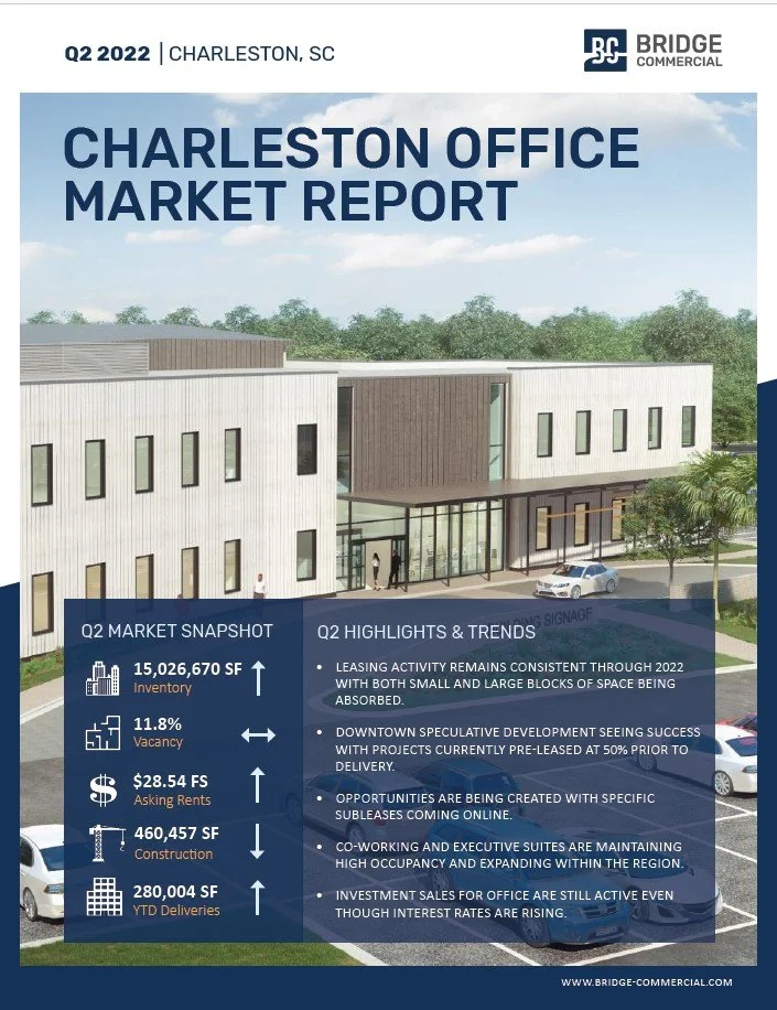
Office property format
Office graphics should make business usability easy to understand. Useful fields can include available area, floor availability, parking, building class when verified, lease structure, transit proximity, amenities, and potential suite configuration. If a property is designed for a specific use, that positioning can be mentioned, but the wording should not imply restrictions or approvals that have not been confirmed.

Retail property format
Retail marketing should emphasize characteristics that influence customer-facing businesses. Visibility, frontage, access, parking, nearby uses, signage opportunities, and location context may be more useful than generic statements about quality. The photograph should show the storefront clearly whenever possible, while a secondary image can demonstrate interior condition.

Industrial property format
Industrial properties benefit from a specification-driven layout. Square footage, loading doors, clear height, yard area, power, zoning, parking, and access routes can be more important than decorative photography. A good graphic still needs a strong visual, but the supporting information should make the operational value of the property immediately understandable.

Writing the caption that supports the graphic
The graphic and caption should perform different jobs. The image should provide quick recognition, while the caption can answer questions that cannot fit comfortably into the design. A practical caption can begin with the property status, identify the asset, explain the strongest business advantage, provide two or three verified facts, and finish with a clear next step.
For example, a hypothetical office listing caption could begin with the availability status, identify the submarket, mention the available area, describe a relevant feature such as parking or transit access, and invite qualified readers to request additional property information. The example should not invent pricing, availability, tenant names, or financial results.
Captions can also add local expertise. Instead of repeating everything visible in the graphic, explain why the property may matter within its submarket. A retail post could discuss the importance of visibility or access. An industrial post could explain why loading configuration matters. An office post could describe the relevance of proximity to transportation or nearby commercial amenities.

Real estate ad templates for Facebook-style campaigns
Commercial advertising should begin with a defined objective. A listing-awareness campaign, leasing campaign, investor campaign, and lead-generation campaign do not necessarily need the same creative. The template should reflect what the audience is expected to do after seeing the message.
A property-awareness graphic might use the building photograph and a short property identity. A leasing graphic might prioritize available area and major tenant benefits. An investment graphic might present a small number of verified financial indicators. A market-awareness graphic might highlight a local trend and offer a reason to continue reading.
It is also useful to create several variations from the same design system. One version can lead with a hero photograph, another can use a property-detail layout, and another can use a market statistic. Maintaining the same branding across those variations allows a brokerage to test different messages without creating an inconsistent visual identity.

Facebook page template design and brand consistency
A social page should look like the same company across its cover, profile identity, listing posts, market graphics, and transaction announcements. This is where a real estate facebook page template design approach becomes useful. The objective is not to make every graphic identical; it is to establish recognizable rules that connect the entire page.
Those rules can include a consistent logo position, a defined color palette, two complementary typefaces, standardized contact information, a repeatable headline structure, and consistent photo treatment. Once those decisions are established, the broker can concentrate more on the property information instead of repeatedly solving basic design questions.
A strong page should also be easy to understand without scrolling through many posts. The cover should establish the brokerage identity and market focus. The profile area should clearly communicate what the business does. Recent posts should demonstrate activity, expertise, listings, transaction history, and useful market knowledge. HousingWire and other real estate marketing resources similarly emphasize complete page setup, clear branding, current visual material, and regular publishing. :contentReference[oaicite:1]{index=1}

Real estate Facebook page template examples worth studying
When reviewing real estate Facebook page template examples, look for structural patterns rather than copying another brokerage’s identity. Examine how the page separates listings from educational posts, how transaction announcements are presented, and how market updates are visually distinguished. The goal is to identify principles that can be adapted to the brokerage’s own market.
Useful examples often include a mixture of property photography, short data-led graphics, transaction milestones, market commentary, and local business information. This variety prevents the page from becoming a stream of identical promotional cards. It also gives followers reasons to remain connected when they are not actively searching for a property.
Commercial real estate professionals can also review public discussions on Reddit when researching how brokers and investors respond to social advertising. Such discussions are best treated as anecdotal observations rather than formal evidence. One recent commercial real estate discussion described a broker using a small Meta campaign for a 560-square-foot office listing and receiving several tour requests, but that individual experience should not be treated as a general performance benchmark. :contentReference[oaicite:2]{index=2}

Commercial property templates for Word and PDF workflows
Some brokerages still prefer a document-based workflow for preparing marketing sheets before adapting the information into social graphics. Word documents can be useful for drafting structured property information, while PDF documents can preserve the intended layout for review or sharing. The important principle is to maintain one verified source of property facts so that social posts do not introduce inconsistent figures.
A document-based workflow is especially useful when a listing has many details. The broker or marketing coordinator can maintain the address, property type, size, pricing, lease terms, zoning information, amenities, and contact information in a structured record. The social graphic then uses only the fields needed for that particular post.
This approach reduces the risk of publishing an outdated price or incorrect availability status. When the property changes, update the underlying information first, then revise the related social assets. A template is most useful when it supports accuracy as well as visual consistency.

How to make a commercial listing graphic easier to scan
Start with one dominant message. If the property is newly listed, the phrase identifying that status should be immediately visible. If the purpose is leasing, availability should be clear. If the purpose is a market update, the market topic should lead. A viewer should not need to inspect every element to understand the reason for the post.
Next, limit the number of competing facts. Three to five strong facts are often easier to scan than ten smaller facts. Choose information that helps qualify interest. For a warehouse, square footage and loading may matter more than decorative amenities. For retail, frontage and access may matter more than an interior finish description.
Finally, preserve breathing room. White space or open visual areas help separate the property photograph from the information. Crowding every available pixel with text, icons, borders, and logos makes the post harder to understand. Professional commercial design often looks restrained because restraint allows important information to stand out.

Using data without making unsupported claims
Commercial real estate marketing frequently includes numerical information, which creates an important responsibility for accuracy. Prices, rents, square footage, occupancy, cap rates, vacancy rates, and construction figures should come from an identifiable and current source. A template should never encourage a marketer to fill empty spaces with guessed numbers simply because a graphic looks better when every field contains information.
Market data needs additional care because figures can vary by geography, asset class, measurement method, and reporting period. A vacancy rate for one office submarket should not be described as the condition of an entire city unless the source supports that interpretation. The same principle applies to asking rents and transaction volumes.
Charts can be particularly effective because they turn complex information into a visual comparison. However, a chart should identify the period and geography when those details matter. A short caption can explain what the viewer should notice without overstating what the data proves.

Common mistakes that weaken commercial realtor posts
One common mistake is trying to make the social graphic function as a complete offering memorandum. Too much information reduces readability and can cause important facts to disappear into a dense block of text. The better approach is to use the graphic as an entry point and place deeper information in the caption or an appropriate property information destination.
Another mistake is inconsistent branding. If every post uses different colors, fonts, logo sizes, and contact layouts, visitors may have difficulty recognizing that the posts belong to the same brokerage. Consistency is especially valuable for commercial specialists because their audience may encounter the same brokerage repeatedly across different property types.
A third mistake is relying on generic property language. Phrases such as “great opportunity” or “prime location” are weak when they are not supported by a specific explanation. Stronger messaging identifies what makes the property relevant: a verified location advantage, a particular building configuration, a meaningful access feature, a tenant-oriented amenity, or a clearly stated investment characteristic.

Practical Solution
The most practical solution is to build a small commercial content system instead of relying on one graphic. Start with five core layouts: new listing, leasing opportunity, transaction result, market update, and professional service. Give all five layouts the same logo treatment, color palette, typography, contact area, and image style. This creates a recognizable visual system while allowing each post to communicate a different purpose.
Next, create a property-information checklist before designing. Verify the property name or address, city or submarket, property type, available area, pricing or lease information, major features, status, and contact details. Identify which facts are suitable for public marketing and which belong in more detailed materials. This step prevents a visually polished graphic from carrying an outdated or unsupported claim.
Then prepare the post in layers. First select the strongest property image. Second add the status label. Third add the property identity. Fourth choose only the most useful supporting facts. Fifth add the call to action. Finally, inspect the graphic at a small size to make sure the hierarchy still works. If the viewer cannot understand the post quickly, remove secondary information before reducing the text size.
For an ongoing campaign, maintain a simple publishing schedule that mixes property promotion with useful commercial knowledge. One week might highlight a new office listing, another might explain a local market indicator, and another might present a completed transaction. The exact schedule can vary by brokerage, but the underlying principle is to give the audience both inventory and expertise.
Before publishing, perform a final accuracy check. Confirm that the property status is current, the contact information is correct, the image represents the actual asset, and every numerical claim can be supported. If the post is later promoted as an advertisement, review the platform’s current housing-related advertising rules and any applicable local real estate requirements before launch. A polished template is valuable only when the information inside it is reliable.

Choosing between simple and data-rich layouts
A simple layout is usually best when the property photograph is compelling and the purpose is awareness. A data-rich layout is more appropriate when the audience needs several facts before deciding whether to investigate further. The choice should be based on the decision the viewer is being asked to make.
For a first-touch listing post, a strong photograph, status, property identity, and a few facts may be enough. For an investor-oriented post, the design can allocate more space to verified financial and operational information. For a market update, the graphic can become more chart-focused while keeping the brokerage identity visually consistent.
There is no single layout that works equally well for every commercial property. A successful commercial realtor facebook Template is therefore better understood as a flexible design framework. Its value comes from making good decisions repeatable while preserving enough room for the unique characteristics of each property.

Building a repeatable content library
A commercial brokerage can organize its templates around the property lifecycle. A listing begins with a launch graphic, may progress to leasing or showing content, and can later become a transaction-result post. The same property can also generate educational content about its submarket, asset class, or relevant business characteristics.
This lifecycle approach reduces the pressure to invent a completely new social idea every time a property changes status. Instead, the marketing team can update the relevant fields and select the layout that matches the new event. The result is a more coherent page and a more efficient internal workflow.
It also creates an archive of useful examples. Over time, the brokerage can review which layouts communicate information most clearly, which property photographs perform well visually, and which topics generate meaningful conversations. Those observations can guide future creative decisions without relying on unsupported claims about universal engagement rates.

How to evaluate a finished template
Before using a commercial template repeatedly, inspect it for readability, adaptability, accuracy, and branding. A good design should accommodate both short and long property names without breaking the hierarchy. It should allow the broker to replace one photograph with several images without making the layout unstable.
Check the template on a mobile screen as well as a larger display. Small text that looks acceptable in a design editor may become difficult to read in a social feed. The most important information should remain recognizable without requiring the viewer to zoom in.
Finally, evaluate whether the design makes the property look like the subject rather than making the graphic itself the subject. Decorative elements can support a professional appearance, but the building, opportunity, and relevant facts should remain the focus.

Reference Examples
A commercial realtor facebook Template is easiest to evaluate when its structure can be compared with real commercial property graphics. The most useful references show how property photography, status labels, pricing, availability, market facts, and contact information can be arranged without making the visual unnecessarily dense. Some examples are designed specifically for social feeds, while others are property flyers or market-report graphics that demonstrate information hierarchy. Studying these formats can help a broker decide which elements belong in the image itself and which information should remain in the accompanying caption or supporting material.
The references below also demonstrate why there is no single visual formula for commercial real estate marketing. An office listing may benefit from a clean building photograph and a small specification panel, while an industrial opportunity may require aerial imagery, loading information, and site context. Investment-oriented graphics may prioritize financial indicators, whereas market reports rely on charts and trend summaries. Comparing these examples helps clarify how a commercial realtor facebook Template can remain visually consistent while adapting to different property types, audiences, and marketing objectives.

Cap Rate Infographic
Source: Legacy Coastline Equity

Shops on Navigation Commercial Property Graphic
Source: LoopNet
Industrial Warehouse Units for Lease
Source: LoopNet
Quarterfield Medical Building at 7671 Quarterfield Road
Source: LoopNet
Marion Industrial Park Listing
Source: Showcase

G6-Branded 155-Room Hotel for Sale in San Antonio
Source: BusinessesForSale
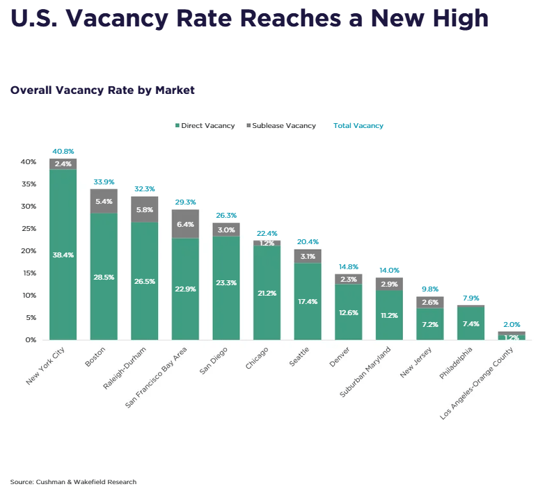
U.S. Office Vacancy Rates by Market
Source: Seeking Alpha
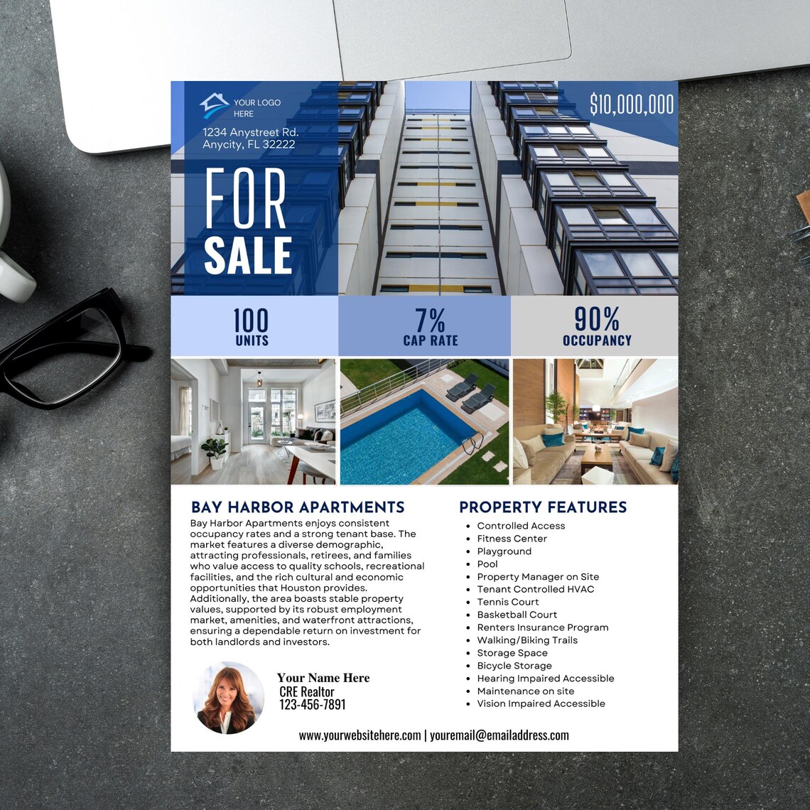
Bay Harbor Apartments For Sale Flyer
Source: Etsy
19-35 Steinway Street Warehouse Lease
Source: Greiner-Maltz Real Estate
2 Copeland Avenue Suite 301 Office Lease
Source: FlippingBook
