An enterprise brand introduction Template is most useful when it does more than provide attractive pages. It should help an organization explain who it is, what it stands for, whom it serves, how it is positioned, and how its identity should appear across communications. For large organizations, this structure matters because different departments, regions, agencies, vendors, and leadership teams may all communicate the same brand in different contexts. A well-designed template creates a common framework without forcing every business unit into identical messaging.
The strongest enterprise brand documents connect strategic information with practical visual rules. A reader should be able to understand the brand story, mission, positioning, audience, values, identity system, voice, typography, color logic, imagery, and basic usage principles without searching through unrelated files. Current brand-guideline references commonly organize these elements into sections covering strategy, logos, colors, typography, imagery, voice, and implementation. The exact depth should depend on the organization, its number of audiences, and the number of teams using the document.
This article explains how to structure an enterprise brand introduction template, what belongs in each section, how to choose between presentation and document formats, how to connect the introduction to broader brand management, and how to turn a static template into a useful working reference. The visual examples below are included to help readers recognize common patterns in real brand books, corporate identity manuals, presentations, and guideline systems.
What an Enterprise Brand Introduction Template Should Accomplish
The first job of an enterprise brand introduction template is orientation. A new stakeholder should quickly understand the organization behind the brand and the reason the brand exists. This usually begins with a concise company description, followed by purpose, mission, vision, values, audience, and positioning. These elements should not be treated as isolated statements. They should reinforce one another so that the reader can see a logical relationship between what the organization does, why it matters, and how it wants to be perceived.
A second job is alignment. Enterprise brands often operate across multiple products, services, markets, and communication channels. A common introduction structure gives internal teams a shared language for describing the organization. It can also reduce inconsistencies between corporate presentations, sales materials, recruitment communications, partner documents, and external campaigns. The goal is not to eliminate creativity; it is to establish the strategic boundaries within which creativity remains recognizable as the same brand.
A third job is practical reference. A good template should answer predictable questions before they become production problems. Where does the logo belong? Which color combinations are preferred? Which typefaces establish hierarchy? How should the organization describe itself? What tone should executive communications use? Which visual styles fit the brand? Which treatments should be avoided? A useful guide turns these decisions into visible standards rather than leaving them to memory.

Core Sections of an Enterprise Brand Introduction
1. Brand overview
The opening section should answer the basic question, “Who are we?” Keep the explanation concise but substantive. Include the organization name, a short description of its business, major areas of activity, and the central value it creates. If the enterprise has several business units, explain the relationship between the corporate brand and those units rather than listing every service on the first page.
A useful overview avoids empty corporate language. Instead of saying that an organization is simply “innovative, trusted, and customer-focused,” explain what it actually does and what distinguishes its role. For example, a hypothetical technology enterprise might describe itself as a provider of infrastructure and data services that helps large organizations modernize complex operations. The example is illustrative rather than a factual description of a particular company.
The opening should also establish the audience for the document. A corporate brand introduction intended for executives may emphasize strategic positioning and organizational purpose, while one used by designers and communication teams may need more visual direction. If the same document serves several audiences, organize the content so that the first pages remain accessible while later sections provide greater operational detail.

2. Purpose, mission, vision, and values
Purpose describes the broader reason the organization exists. Mission describes what the organization does and how it creates value. Vision describes a desired future state. Values describe principles that influence decisions and behavior. Keeping these concepts distinct makes the introduction easier to understand and prevents a single paragraph from trying to perform four different strategic functions.
Values should be especially practical. If an organization lists “integrity,” “innovation,” and “excellence,” readers need enough explanation to understand what those words mean in daily behavior. A strong template can pair each value with one short behavioral statement. For instance, an illustrative value of “clarity” could be defined as communicating complex information in a direct and understandable way.
Mission and vision statements also need proportion. A presentation does not need a page of dense prose when two concise statements can communicate the idea better. The template should create visual hierarchy so that the reader can immediately distinguish purpose from mission, vision, and values. This makes the document more useful during presentations, onboarding, planning sessions, and strategic reviews.

Building the Strategic Brand Story
Enterprise branding becomes easier to understand when the organization can tell a coherent story. A brand story does not have to be fictional or dramatic. It is a structured explanation of the organization’s background, challenge, role, distinctive capabilities, and intended future. The story should connect the organization’s history to its current purpose without turning the introduction into a lengthy corporate chronology.
A useful structure is to begin with the market or customer context, explain the problem the organization is designed to address, describe its distinctive contribution, and then connect that contribution to the future direction. This approach gives readers a reason to care about the organization before they encounter visual identity rules. It also provides useful source material for executive speeches, corporate presentations, websites, internal communications, and sales narratives.
Storytelling should remain evidence-based. If a company claims leadership, scale, innovation, or market impact, the statement should be supported by information that the organization can substantiate. Avoid inserting invented figures simply to make the introduction appear impressive. A credible enterprise brand document is more valuable when it distinguishes verified organizational facts from illustrative examples and aspirational language.
Brand positioning and differentiation
Positioning explains the place a brand wants to occupy in the minds of its relevant audiences. An enterprise template can make positioning easier to understand by separating the target audience, category, customer need, brand promise, differentiators, and proof points. This structure prevents positioning from becoming a vague slogan.
Differentiators should describe meaningful distinctions rather than generic strengths. “High quality” is difficult to own because many organizations can say the same thing. A stronger statement identifies a particular capability, experience, specialization, operating model, or customer outcome. The supporting proof points should then explain why the differentiator is credible.
For large organizations, positioning may exist at several levels. The corporate brand can have one overarching position while individual products or divisions have more specific positions. The introduction should explain the relationship between those levels so that teams do not accidentally create competing descriptions of the same enterprise.

Logo Structure and Usage Rules
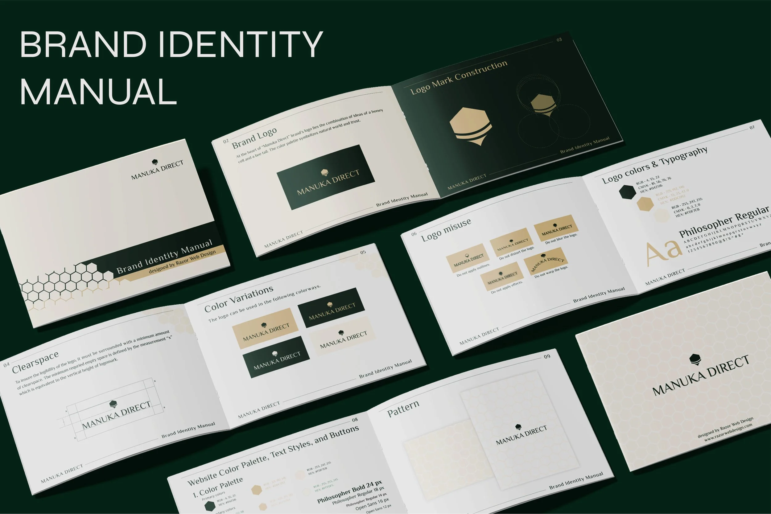
The logo section is one of the most practical parts of an enterprise brand document. It should identify the approved primary mark and explain when alternate versions are appropriate. Depending on the identity system, variations may include horizontal, stacked, symbol-only, monochrome, reversed, or limited-use versions.
Clear space is another essential component. The guide should establish a repeatable method for determining the protected area around the mark. Minimum size should also be specified where the organization has established tested thresholds. The purpose is straightforward: preserve recognition and legibility when the logo appears in crowded layouts, small formats, or different production environments.
Incorrect-use examples are often more useful than abstract warnings. Show what happens when a logo is stretched, rotated, recolored, crowded, placed against an unsuitable background, or combined with unauthorized effects. These examples make the rule easier to understand for designers, vendors, and non-specialist staff who may not work with identity systems every day.

Logo variations and hierarchy
Multiple logo versions should have a clear hierarchy rather than being presented as interchangeable choices. The primary version should normally be the default, while secondary versions should have specific reasons for use. A template can document those situations in simple language, such as “use the horizontal lockup in wide layouts” or “use the symbol when the full wordmark cannot remain legible.”
Enterprise brands also need to consider relationships between the corporate logo, product marks, sub-brands, endorsed brands, partnerships, and event identities. This is where brand architecture becomes relevant. A simple diagram can show which identities are independent, which are endorsed by the parent organization, and which share common visual assets.
The important principle is consistency of hierarchy. The visual relationship between parent and sub-brand should reflect the strategic relationship between them. A template that explains both relationships helps prevent teams from making visual decisions that unintentionally change the perceived structure of the enterprise.

Color and Typography Systems
Color guidance should identify primary, secondary, and supporting colors and provide the technical values needed for consistent reproduction. Depending on production requirements, this can include HEX, RGB, CMYK, and other established specifications. More important than the codes themselves is the usage logic: which colors dominate, which are accents, which combinations are preferred, and which combinations should be avoided.
Typography requires similar discipline. An enterprise template should identify primary and secondary typefaces, weights, hierarchy, spacing principles, and fallback choices where relevant. It should show how a headline differs from a subheading, body text, caption, label, or data point. This prevents teams from using the correct font in an inconsistent hierarchy.
Color and typography should be treated as a system rather than decoration. The same rules need to remain recognizable across presentations, reports, web pages, printed documents, signage, and internal communications. A good template therefore demonstrates the rules visually instead of relying only on descriptive paragraphs.


Brand Voice and Messaging
Visual consistency is only half of an enterprise identity system. The written voice determines how the organization sounds. A brand voice section should describe several stable characteristics and then demonstrate them with examples. Terms such as confident, direct, thoughtful, technical, warm, or authoritative are useful only when accompanied by practical explanations.
A useful structure separates voice from tone. Voice represents the consistent personality of the organization, while tone can shift according to audience and situation. An investor communication, customer support message, recruitment page, and technical document may not sound identical, but they can still share the same underlying character.
Messaging hierarchy is equally important. A template can define the corporate description, short positioning statement, value proposition, key messages, supporting proof points, and preferred terminology. This creates a foundation for writers without forcing every communication to use identical wording.

Creating a brand template that teams actually use
When creating a brand template, start by identifying the decisions that teams repeatedly need to make. Do not begin with decorative layouts. First list the questions that designers, writers, marketers, executives, sales teams, agencies, and vendors ask during normal work. The final document should answer those questions quickly.
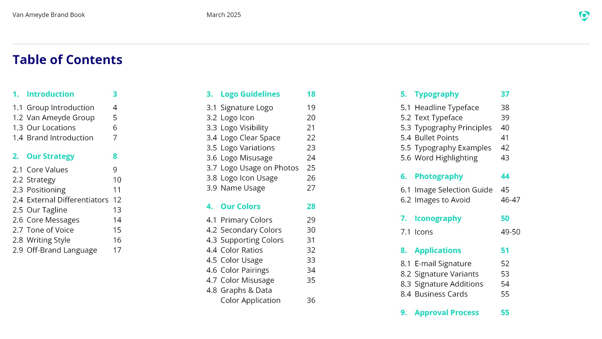
Next, organize the material into a logical progression. A practical sequence is brand overview, purpose and positioning, audience, brand architecture, logo system, color, typography, imagery, voice, messaging, examples, and governance. The exact order can change, but readers should move from strategic context toward practical execution.
Finally, test the template with people who were not involved in creating it. Ask them to find a specific rule, identify the primary logo, describe the brand voice, and determine which colors belong in a particular situation. Their experience reveals whether the document is genuinely usable or merely attractive.

Choosing Between Presentation, Document, and Online Formats
An enterprise brand introduction can exist as a presentation, a formal document, a compact reference sheet, or a structured online guide. A presentation works well when the primary purpose is introducing the organization to an audience. It can use larger visual areas, concise statements, and a narrative sequence that supports a speaker.
A longer document works better when the main purpose is reference. It can contain more detailed logo rules, typography examples, color specifications, imagery direction, and implementation notes. A brand book may use a page-based structure because readers often return to individual sections rather than reading every page in sequence.
An online guide can be useful when the organization updates its standards regularly or needs a central reference for multiple teams. Whatever format is selected, version control matters. The document should show its version, date, owner, and review responsibility so users can distinguish current standards from older material.
When a Word-style structure makes sense
A structured document format is useful when the enterprise needs substantial written explanation alongside visual examples. A document can make it easier to maintain sections such as brand narrative, messaging principles, editorial standards, terminology, and governance. It can also be useful for teams that need a printable reference.
The key is to preserve visual hierarchy. A document should not become a wall of text simply because the format allows long paragraphs. Use strong headings, concise sections, diagrams, examples, and carefully selected visual references. The same strategic clarity expected from a presentation should remain present in a document-based guide.
Organizations sometimes use a document as the master reference and a presentation as the introduction layer. This can be effective when the two formats are maintained together. The presentation explains the brand at a high level, while the detailed guide handles production rules and operational questions.

Using a Sample of Brand Template as a Planning Reference
A sample of brand template can be valuable when planning the structure of a new enterprise guide, but it should be treated as a structural reference rather than something to reproduce literally. Examine how the sample establishes hierarchy, where it places strategic information, how it demonstrates logo rules, and how it transitions from brand story to visual standards.
Compare several examples rather than relying on one design. One brand book may emphasize strategy, another may focus on visual identity, and another may prioritize practical production rules. Looking across different structures helps reveal which sections are universal and which depend on organizational needs.
The most useful reference is one that makes decisions easy to locate. A visually sophisticated guide can still fail if users cannot find the correct logo rule, color value, voice principle, or example quickly. Navigation and information hierarchy therefore matter as much as visual polish.

Introduction to Brand Management and Governance
An enterprise brand document becomes significantly more valuable when it is connected to governance. Introduction to brand management is not simply about creating a logo or writing a mission statement. It involves maintaining the strategic and visual integrity of the brand as the organization changes, expands, launches products, enters markets, and works with external partners.
Governance should identify who owns the standards, who can approve exceptions, how changes are recorded, and how teams receive current information. The exact responsibilities vary by organization. Some enterprises use a central brand team, while others distribute responsibilities among marketing, communications, design, legal, and business-unit leaders.
A governance section can also establish a review cycle. The brand guide should not become outdated while the business evolves. A scheduled review can check whether the positioning remains accurate, whether visual standards still work across new channels, whether new sub-brands need architectural guidance, and whether teams are encountering recurring questions that deserve clearer documentation.

Common Mistakes to Avoid
One common mistake is treating the introduction as a company history document. Historical information can establish credibility and context, but the reader usually needs to understand the current brand first. Keep historical material focused on events that explain present positioning, purpose, or identity rather than filling pages with chronology.
Another mistake is separating strategy from design too aggressively. If the logo, color palette, typography, and imagery appear without explaining what they are intended to communicate, users may see them as arbitrary rules. Connecting visual decisions to brand personality and positioning makes the system easier to understand and apply consistently.
A third mistake is creating rules without examples. Saying “use the logo correctly” is not enough. Show correct and incorrect treatments. Saying “use a confident tone” is also incomplete. Provide sample language that demonstrates the desired behavior. Examples turn abstract standards into decisions people can recognize.

Practical Solution
Start by creating a one-page content outline before designing the enterprise brand introduction template. List the brand overview, purpose, mission, vision, values, audience, positioning, differentiators, architecture, logo rules, colors, typography, imagery, voice, messaging, examples, ownership, and version information. Mark each item as either essential, supporting, or optional. This prevents the first version from becoming unnecessarily long and makes it easier to identify missing strategic information.
Next, collect verified brand assets and source material from the organization. Use the approved logo files, established color specifications, current typeface decisions, validated company descriptions, and authorized messaging. Separate confirmed facts from illustrative examples. If the organization has several divisions, document the relationship between the corporate identity and those divisions before designing the visual hierarchy.
Then build a short presentation layer and a deeper reference layer. The presentation should explain the brand story and strategic foundation in a concise sequence. The reference layer should contain detailed identity rules, examples, and implementation guidance. Add version information and an identified owner so future revisions can be controlled. Finally, test the document with actual users from different functions and revise unclear sections based on their questions.
A practical workflow can be summarized as follows:
- Define: clarify purpose, audience, positioning, personality, and brand architecture.
- Collect: gather approved identity assets, messaging, visual specifications, and organizational facts.
- Structure: arrange the content from strategic context to practical identity rules.
- Demonstrate: show correct usage, incorrect usage, examples, and real-world contexts.
- Validate: test whether different teams can locate and understand the rules.
- Govern: assign ownership, versioning, review responsibilities, and change procedures.
- Maintain: update the guide when the brand architecture, identity, strategy, or communication needs materially change.

Supporting Enterprise Brand Introduction Materials
Some organizations also need a compact brand book, a detailed identity manual, a corporate profile, and presentation standards. These should not become disconnected documents. The same terminology, positioning, logo hierarchy, colors, typography, and voice should carry across them. A template brand book pdf, for example, is most useful when it reflects the same standards as the presentation and corporate identity reference.
For teams preparing educational or entrepreneurship material, a request such as develop a brand name entrepreneurship ppt can be addressed by adding naming logic, audience considerations, differentiation, and brand rationale to the strategic portion of the deck. The naming section should explain the criteria used to evaluate names rather than presenting a random list of invented options as if they were validated market choices.
Similarly, a brand document may be paired with a structured content guide. The objective is to make the enterprise identity easier to reproduce across different communication environments while preserving strategic consistency. The format can change, but the underlying decisions should remain connected to one coherent brand system.

How to Evaluate the Finished Template
A finished enterprise brand introduction template should be evaluated for clarity before aesthetics. Ask whether a reader can explain the organization after viewing the first few sections. Ask whether the positioning is understandable without a presenter. Ask whether the visual identity rules are specific enough for a designer or vendor to follow without repeatedly asking for clarification.
Next, evaluate consistency. Check whether the same terminology is used for the organization, products, audiences, and strategic concepts. Confirm that visual examples follow the rules they are intended to demonstrate. Check whether color specifications are complete and whether typography examples show hierarchy rather than simply displaying typefaces.
Finally, evaluate usability. A successful enterprise guide should reduce uncertainty rather than create more questions. If users frequently ask where to find the latest version, which logo to use, which color is preferred, or how the brand should sound, those questions are signals that the document needs clearer navigation or stronger examples.
Reference Examples
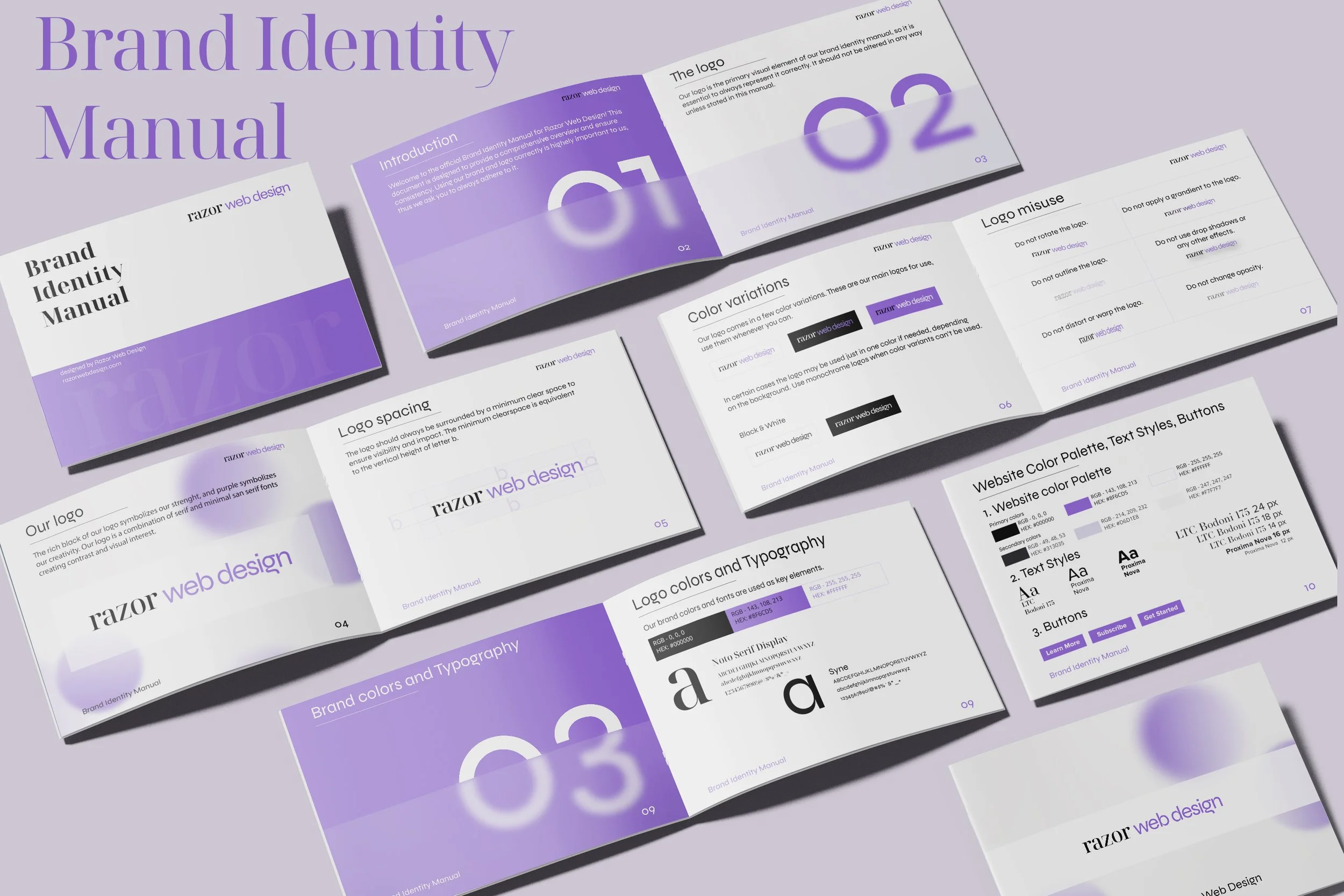
An enterprise brand introduction template is easiest to understand when its structure can be compared with real examples of brand books, corporate identity manuals, presentation systems, and visual identity guides. These references show how organizations and designers commonly separate strategic material from visual standards. They also demonstrate recurring components such as brand overview pages, logo construction, clear-space diagrams, color systems, typography hierarchy, messaging frameworks, and practical examples. The purpose of these references is not to suggest that one layout is universally correct. Instead, they provide visual context for evaluating hierarchy, density, navigation, consistency, and the relationship between strategic information and brand execution.
The following examples should be viewed as visual references rather than ready-made solutions for every enterprise. A strong enterprise brand introduction template should be adapted to the organization’s actual structure, audience, communication needs, and governance model. Pay particular attention to how each example establishes a visual hierarchy, how it explains identity rules, and how it combines concise language with diagrams or examples. When comparing references, prioritize clarity and usefulness over decorative complexity, because the most valuable brand document is one that stakeholders can understand and use consistently.
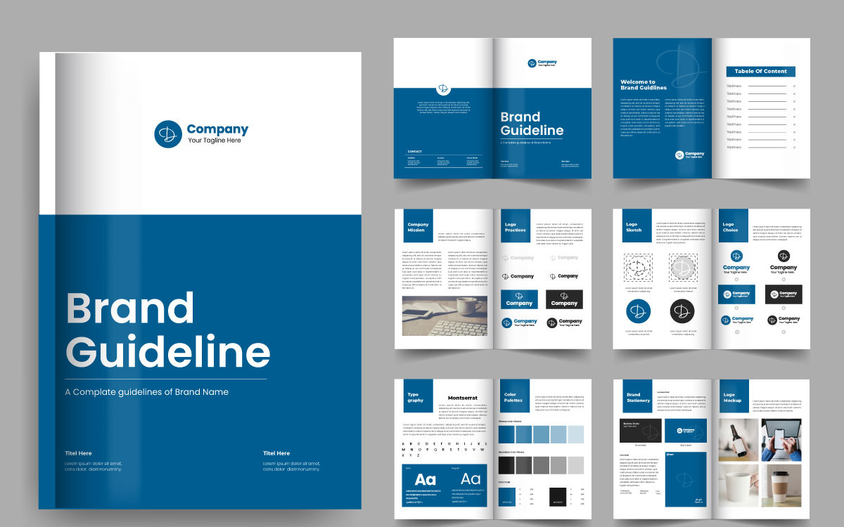
Brand Guideline Brochure Template
Source: TemplateMonster
Introduction to OptiTek Industries
Source: Venngage
Voice and Tone
Source: Slack
Brand Messaging Framework
Source: Aha!

Lumosolar Brand Guidelines Overview
Source: Behance

Brand Builders Design Guidelines
Source: NickelBronx
Brand Guidelines Template Overview
Source: Behance

Comprehensive Brand Guide Mockup
Source: Geoconnect

Softmetric Brand Identity & Guidelines
Source: Behance

Berkley Group Brand Guidelines
Source: Hive Creative Group
