A law firm insurance brochure Template is a structured starting point for presenting insurance-related legal services in a professional, readable, and credible format. The strongest versions do more than place a firm name, logo, and contact details on attractive panels. They explain the firm’s insurance practice, identify the types of matters handled, clarify who the intended audience is, and create a logical path toward contacting the firm. Current template libraries show that law brochures commonly use bi-fold and tri-fold structures, with dedicated areas for practice areas, firm information, service descriptions, credibility elements, and contact details.
For an insurance-focused practice, the brochure should be especially disciplined because insurance disputes can involve policy language, coverage questions, claims handling, liability issues, exclusions, litigation, and negotiations. A prospective client should be able to understand the firm’s focus without having to interpret dense legal terminology. A well-designed brochure therefore combines concise editorial writing with strong information hierarchy rather than attempting to summarize every possible legal service.
Research into current legal brochure templates also shows an important distinction between a visual template and the actual content strategy. A template can provide panels, typography, image placement, and contact areas, but the firm must supply accurate practice descriptions, attorney information, jurisdictional details, disclaimers where appropriate, and a clear call to action. The result should feel specific to insurance law rather than like a generic attorney brochure with the word insurance inserted into a headline.

What an Insurance-Focused Law Firm Brochure Should Accomplish
The primary job of an insurance law brochure is to communicate relevance quickly. A reader may be looking for counsel concerning coverage, a disputed claim, professional liability, property damage, business interruption, bad-faith allegations, defense obligations, or another insurance-related matter. The opening panel should therefore establish the firm’s focus before the reader reaches detailed information. A short positioning statement is usually more effective than a broad slogan because it tells the reader what type of legal problem the firm handles.
The inside panels can then explain the firm’s approach. For example, a brochure might separate coverage analysis, claims disputes, insurance defense, policy interpretation, and insurance litigation into distinct blocks. These labels should only be used when they accurately reflect the firm’s services. The brochure should never imply experience, certifications, case outcomes, geographic coverage, or practice specialties that the firm cannot substantiate.
Visual hierarchy is equally important. A reader should be able to identify the firm name, primary insurance practice, principal services, jurisdiction, and contact method within seconds. Current brochure examples frequently use strong cover headlines, restrained color palettes, compact service lists, and clearly separated contact panels. These conventions can be adapted for an insurance practice without copying another firm’s wording or identity.

Choosing Between Bi-Fold, Tri-Fold, and Multi-Page Formats
A tri-fold format works well when the firm needs a compact overview. Six panels provide enough space for a cover, introductory statement, several insurance practice areas, credibility information, and contact details. It is particularly useful for printed handouts because the reader can move through the information in a predictable sequence. The limitation is space: lengthy explanations of coverage disputes or complex litigation strategies can quickly make the brochure crowded.
A bi-fold format offers larger panels and can feel more formal. It can work especially well when the firm wants a strong cover, a concise description of its insurance practice, and a larger interior section devoted to services. The additional visual space also makes it easier to maintain generous margins and readable typography. A larger panel, however, should not become an excuse to fill every available area with text.
Multi-page brochures or booklet-style formats are appropriate when the firm serves several audiences or maintains multiple insurance practice lines. A longer document might separate insurer representation, policyholder representation, commercial coverage, professional liability, property claims, and litigation into individual sections. The key is to give every page a clear purpose rather than turning the brochure into a miniature legal treatise.
Designing the Cover for Insurance Legal Services
The cover should answer three questions immediately: who is the firm, what does it do, and why should the reader continue? A restrained headline such as “Insurance Coverage and Litigation Counsel” can be more informative than a vague phrase about justice or excellence. A secondary line can identify the firm’s jurisdiction or principal client groups when that information is accurate and useful.
Legal imagery should reinforce the subject without overwhelming the message. Scales of justice, law books, policy documents, architectural details, or a carefully composed document scene can communicate professionalism. For an insurance brochure, imagery connected to documents and analysis may be more relevant than dramatic courtroom photography because insurance work often begins with careful examination of policies, correspondence, claims records, and factual evidence.
Color should also support credibility. Navy, charcoal, muted blue, burgundy, cream, and restrained metallic accents are common choices in legal communications. The specific palette matters less than consistency and contrast. A brochure should remain readable when printed, viewed on a screen, or reproduced in a less sophisticated office printer. Decorative elements should never interfere with essential contact information.

Building the Insurance Practice Area Section
The insurance practice section should be written from the reader’s perspective. Instead of listing every legal concept the attorneys know, identify the situations in which clients typically seek assistance. A useful structure might include coverage evaluation, claim disputes, insurer obligations, policy interpretation, defense matters, subrogation, and litigation, provided these services genuinely match the firm’s practice.
Each service should receive a short explanation. “Coverage disputes” could be followed by a sentence explaining that counsel evaluates policy language and the facts surrounding a disputed claim. “Insurance litigation” could explain that the firm represents clients in disputes that progress toward formal proceedings. The objective is not to provide legal advice in the brochure but to help the reader determine whether the firm’s services are relevant to the problem.
Lists are valuable because they make complex legal services easier to scan. However, a list should not become a collection of unexplained buzzwords. If an acronym, technical insurance term, or specialized doctrine is essential, explain it briefly. A prospective client who understands the brochure without a legal background is more likely to recognize the firm’s relevance and take the next step.

Using Policy and Claims Concepts Without Making the Brochure Too Technical
Insurance law frequently depends on precise documents, definitions, exclusions, endorsements, deadlines, correspondence, and factual circumstances. A brochure can acknowledge that complexity without reproducing it. The best editorial approach is to translate technical work into recognizable client problems. Instead of writing a long discussion of contractual interpretation, explain that the firm reviews policy language and claim circumstances to assess coverage positions and available legal strategies.
Another useful technique is to distinguish between what the firm reviews and what the firm does. Documents might include policies, endorsements, reservation-of-rights letters, claim correspondence, loss records, and relevant agreements. Services might include legal analysis, negotiation, dispute resolution, litigation strategy, and representation. This distinction gives readers a clearer picture of the firm’s workflow without promising a particular result.
Brochure copy should also avoid guarantees. Legal outcomes depend on facts, contracts, evidence, procedure, and applicable law. Statements suggesting that a firm will certainly win a dispute or obtain a particular recovery can create ethical and credibility concerns. A better brochure uses precise language such as “advises,” “represents,” “evaluates,” “analyzes,” or “handles,” followed by a factual description of the service.

Writing the Firm Profile and Attorney Information
The firm profile should establish credibility without becoming a biography that consumes half the brochure. A concise paragraph can explain the firm’s insurance focus, client types, geographic reach, and general approach. If the firm has several offices, the relevant locations can be listed separately so readers do not confuse an office location with a statement about where attorneys are admitted to practice.
Attorney information should be selective. Include names, professional roles, relevant practice focus, and credentials that are genuinely useful to the intended audience. If a lawyer is admitted in particular jurisdictions, the information should be accurate and current. Claims about board certification, specialist status, awards, rankings, case results, or professional distinctions should be used only when they can be substantiated and presented in accordance with applicable rules.
A brochure can also use a short “Why this firm” section, but this should contain concrete differentiators rather than generic claims. Experience with a particular class of insurance dispute, a defined geographic focus, multilingual capability, or a particular client service model may be meaningful when accurate. Statements such as “the best firm” or “guaranteed results” are much less useful because they provide little information and can create unnecessary compliance concerns.

Creating Clear Contact and Call-to-Action Panels
A brochure should make contacting the firm easy. The final panel can include the firm name, office address, telephone number, email address, website, and other channels that the firm actually monitors. If the brochure is intended for digital distribution, a QR code can lead to a verified firm page, provided that the destination is maintained and appropriate for the intended audience.
The call to action should be specific but not aggressive. “Contact the insurance practice to discuss your matter” is more informative than a vague instruction to “act now.” If the firm offers consultations, the brochure can explain how prospective clients can request one, while avoiding statements that imply an attorney-client relationship exists merely because someone contacted the firm.
Contact information should also be visually separated from the substantive legal material. Readers frequently skim brochures, so a phone number buried in a paragraph can be missed. A dedicated contact block with strong contrast and generous spacing usually performs better. The same contact details should also align with the firm’s other public materials so that the brochure does not create conflicting information.

Adapting the Template for Different Insurance Audiences
An insurance brochure may serve very different audiences, and the content should reflect that distinction. A policyholder may want to understand whether a claim is covered and how to respond to a dispute. A business may need counsel concerning commercial policies, liability exposure, or a complex claim. An insurer or claims organization may need defense-oriented counsel. These audiences should not necessarily receive identical messaging.
One efficient strategy is to maintain a consistent master design while creating separate versions for major audience groups. The visual identity, logo placement, typography, and contact structure can remain stable while the practice-area copy changes. This creates brand consistency while allowing each brochure to answer the questions most relevant to its readers.
The same approach can support geographic customization. A firm serving several jurisdictions can identify the relevant office or attorney and tailor the jurisdictional language accordingly. A search query such as law firm insurance brochure template california suggests a reader looking for a California-oriented design, but a template alone does not establish California compliance. The State Bar of California treats brochures and similar materials describing a lawyer or law firm as communications subject to professional rules, and current advertising rules prohibit misleading statements. :contentReference[oaicite:0]{index=0}

File Formats and Editing Considerations
Searchers often look for specific production formats because their workflow determines how much control they need. A law firm insurance brochure template pdf may be useful as a reference or print-ready document, while a Word-based format can be more convenient when the firm needs to revise text internally. A phrase such as law firm insurance brochure template word reflects that need for familiar document editing rather than a different kind of brochure.
Some users specifically search for law firm insurance brochure template google docs because they want browser-based collaboration and shared editing. Others may use professional layout software when precise typography, print specifications, image management, and color control are important. The correct format depends on the production process, the people responsible for revisions, and the final distribution method.
Search phrases such as law firm insurance brochure template free download and law firm insurance brochure template download can indicate that the reader is comparing accessible template sources. The important editorial point is to distinguish a template’s advertised licensing terms from the firm’s own legal and branding obligations. Before using any external design, verify its permitted use, included assets, editable elements, and suitability for the intended distribution channel.

How to Evaluate a Template Before Customizing It
Start by examining the number and size of panels. Ask whether the layout has enough room for the firm’s insurance services without reducing the body text to an uncomfortable size. A good template should support a hierarchy of headline, supporting text, service list, credibility element, and contact information. If every panel is already filled with decorative material, it may be difficult to adapt it effectively.
Next, inspect the image areas. A template that relies heavily on attorney portraits may not suit a firm that prefers document-centered branding. A layout based on books, gavels, scales, policy documents, architecture, or abstract legal motifs can often be adapted more easily for insurance work. Images should support the subject rather than imply a specific case, client, result, or event that the firm cannot substantiate.
Finally, examine the text structure. A useful template should provide enough variation for headings, short descriptions, bullet points, credentials, and contact details. Templates with only large decorative headlines and tiny body text may look impressive in a preview but perform poorly as practical client communications. Editorial usability should always outrank visual novelty.
Turning a Sample Copy Into Original Firm Content
A sample copy of a law firm brochure can help establish the amount of information that fits into each panel, but it should not become a substitute for original writing. Use examples to study structure: how the cover introduces the firm, how practice areas are grouped, how the firm profile is positioned, and where contact details appear. Then write new copy based on the actual firm’s services and audience.
For example, a hypothetical insurance practice might organize its interior into three themes: “Coverage Analysis,” “Claims and Disputes,” and “Insurance Litigation.” Under each heading, two or three sentences could explain the type of legal assistance provided. The firm could then add a short section describing its geographic focus and a separate contact panel. This structure communicates more effectively than a long block of generalized promotional language.
A useful quality-control method is to have someone unfamiliar with the firm’s practice read the brochure and explain what they believe the firm handles. If their interpretation differs substantially from the intended message, the copy probably needs revision. This simple test helps identify jargon, ambiguous headings, unsupported claims, and missing information before the brochure reaches prospective clients.

Balancing Budget, Quality, and Professional Appearance
A smaller practice may search for a cheap lawyer brochure template because the brochure is only one part of its marketing budget. Cost, however, should not be the only selection criterion. A low-cost template that requires extensive redesign may consume more staff time than a better-structured design that needs only moderate customization.
Look for a layout that minimizes unnecessary editing. If the firm’s logo, colors, insurance service categories, attorney information, and contact details can be inserted without rebuilding the page structure, the design is more practical. It is also wise to examine typography and image quality before committing to a print run because a template that looks acceptable in a small online preview may reveal spacing or resolution problems at larger sizes.
Consistency across the firm’s marketing materials can provide more value than an elaborate brochure. The brochure should visually relate to the firm’s website, letterhead, business cards, and other client-facing materials. A law firm website template can serve as a useful reference for brand colors, typography, navigation language, and practice-area naming, but the brochure should remain optimized for its own format rather than simply copying a webpage.

Connecting the Brochure to the Firm’s Broader Business Plan
A brochure is more effective when it supports a broader business and marketing strategy. The firm’s positioning, target client groups, principal practice areas, geographic priorities, and referral strategy should influence the brochure’s messaging. If the firm’s business plan identifies insurance disputes as a priority service, the brochure should make that practice prominent rather than giving equal space to unrelated areas.
Searchers may encounter phrases such as law firm business plan template doc or law firm business plan template pdf while researching how to structure a new practice. Those planning materials serve a different purpose from a brochure, but they can help clarify the business assumptions behind the brochure. The firm should know whom it wants to reach, what problems it solves, and how it differentiates itself before attempting to communicate those points visually.
The brochure should not promise services simply because a business plan identifies them as future goals. If a new insurance practice intends to expand into a particular jurisdiction or service line later, the current brochure should describe only what the firm is prepared and authorized to provide. This keeps the brochure aligned with reality and reduces the risk of outdated marketing material remaining in circulation.

Practical Solution
Begin by defining the brochure’s audience in one sentence. For example, the hypothetical goal might be “Introduce a regional insurance law practice to businesses and policyholders facing significant coverage disputes.” That statement becomes a filter for every design and writing decision. If a sentence, image, credential, or decorative element does not support that audience, consider removing it.
Next, build the brochure content before finalizing the visual design. Prepare the firm name, positioning statement, insurance practice areas, concise service descriptions, attorney credentials, jurisdictional information, contact details, and appropriate disclosures. Keep the first version intentionally short. It is easier to expand a strong structure than to cut an overcrowded brochure after every panel has been filled.
Then select the format that matches the information volume. Use a compact fold for a simple introduction, a larger fold for a more detailed insurance practice overview, or a multi-page structure when several distinct services require explanation. Review the template at actual reading size, test all links and contact information, verify image licensing, and proofread every legal and jurisdictional statement before publication.
Finally, create a repeatable review process. One reviewer should check factual accuracy, another should assess readability, and a qualified legal professional should review jurisdiction-specific advertising considerations where necessary. California, for example, has specific rules governing attorney communications and advertising, including requirements concerning misleading statements and responsible-lawyer identification. :contentReference[oaicite:1]{index=1} A brochure should therefore be treated as a professional communication, not merely as a decorative marketing piece.

Quality-Control Checklist Before Publication
Before approving the final design, verify that the firm’s name and contact information are correct everywhere they appear. Check telephone numbers, email addresses, website addresses, office locations, attorney names, professional titles, and jurisdictional statements independently. A brochure often remains in circulation for a long time, so even a small error can become a repeated source of confusion.
Review every claim for support. Statements about experience, awards, results, specialization, client outcomes, geographic reach, or professional status should be accurate and presented in a manner consistent with applicable rules. Avoid superlatives that cannot be demonstrated. Where the firm’s service depends on particular facts, explain that legal evaluation depends on the policy, circumstances, evidence, and applicable law rather than implying that the brochure itself establishes coverage.
Finally, print or preview the brochure at the size in which readers will actually encounter it. Look for small text, weak contrast, awkward folds, crowded panels, inconsistent spacing, and contact information that disappears into decorative elements. A polished insurance brochure should feel calm, organized, and authoritative. Its greatest strength should be clarity: the reader should know what the firm handles, whom it serves, and how to make contact.

Reference Examples
A law firm insurance brochure Template is easiest to evaluate when readers can compare real brochure structures rather than relying only on descriptions. The examples below illustrate different approaches to hierarchy, panel organization, legal imagery, typography, contact placement, and professional presentation. Some emphasize a traditional law-firm aesthetic using books, gavels, and scales, while others rely on restrained color blocks and strong editorial hierarchy. They should be treated as visual references rather than as ready-made legal copy. Any firm adapting a design should replace placeholder information with accurate, jurisdiction-appropriate material.
These references also demonstrate why the strongest brochure is rarely the one with the most decoration. A useful insurance-oriented layout should leave sufficient room for practice-area descriptions, client-focused explanations, attorney or firm information, and a clear contact path. Comparing different folds and visual systems can help a firm decide whether its own law firm insurance brochure Template should be compact and highly scannable or more detailed and booklet-like. The goal is to borrow structural ideas while developing original content and maintaining the firm’s own identity.

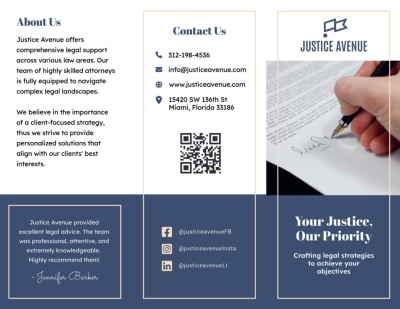
Lawyer Tri-Fold Brochure Template
Source: Template.net :contentReference[oaicite:2]{index=2}

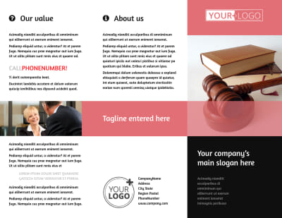
Attorney At Law Bi-Fold Brochure Template
Source: MyCreativeShop :contentReference[oaicite:3]{index=3}

Attorney At Law Bi-Fold Brochure Template
Source: MyCreativeShop :contentReference[oaicite:4]{index=4}

Attorney At Law Tri-Fold Brochure Template
Source: MyCreativeShop :contentReference[oaicite:5]{index=5}
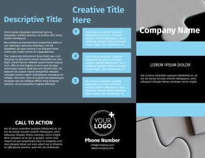
Mergers & Acquisition Firm Tri-Fold Brochure Template
Source: MyCreativeShop :contentReference[oaicite:6]{index=6}
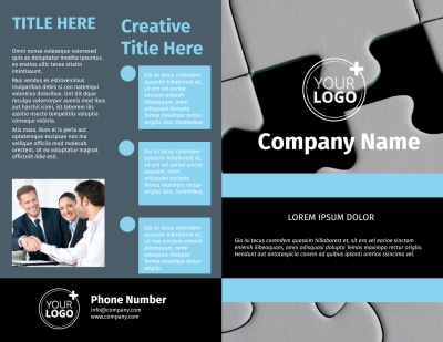
Mergers & Acquisition Firm Bi-Fold Brochure Template
Source: MyCreativeShop :contentReference[oaicite:7]{index=7}
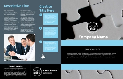
Mergers & Acquisition Firm Bi-Fold Brochure Template
Source: MyCreativeShop :contentReference[oaicite:8]{index=8}

Lawyer & Law Firm Bi-Fold Brochure Template
Source: Template.net :contentReference[oaicite:9]{index=9}
Professional Law Firm Cover Page Template
Source: Template.net :contentReference[oaicite:10]{index=10}
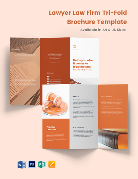
Lawyer Law Firm Tri-Fold Brochure Template
Source: Template.net :contentReference[oaicite:11]{index=11}
