A strong the date business Template is more than a decorative invitation. It is an early communication tool that helps a company place an important event on the calendar before the full invitation, agenda, registration details, or final logistics are ready. For corporate meetings, conferences, retreats, anniversaries, client dinners, launches, networking events, and leadership gatherings, the design needs to communicate the essential information immediately while still reflecting the organization’s identity.
The most useful business event templates balance clarity, hierarchy, branding, and flexibility. A recipient should be able to identify the organization, understand what is being announced, recognize the date, and know whether more information will follow without searching through a dense block of text. Current examples from corporate invitation and design libraries show recurring patterns such as prominent dates, restrained typography, company branding, clear event names, location information, and concise follow-up language.
For that reason, choosing a template should begin with the event rather than the visual style. A formal executive summit may need a very different treatment from a company retreat, product launch, client appreciation dinner, or annual meeting. The most effective starting point is a structure that already matches the communication goal and can then be adapted to the organization’s colors, logo, typography, tone, and delivery format.
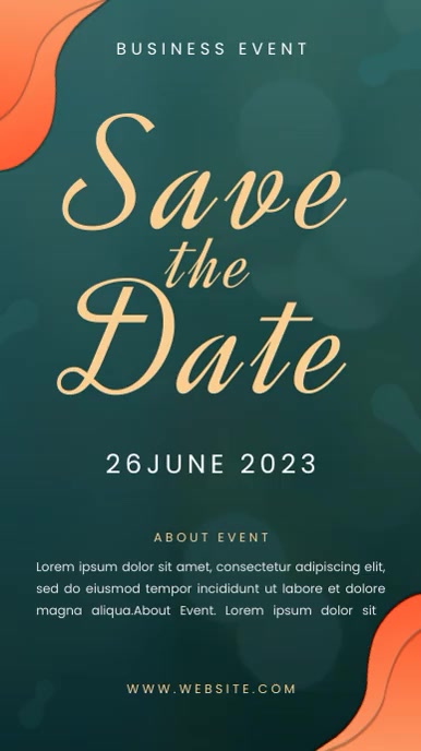
What a Business Save-the-Date Template Is Designed to Do
A business save-the-date design has a deliberately limited purpose: establish the event date early enough for recipients to reserve time in their schedules. It should not attempt to function as the complete invitation. The formal invitation can later contain the detailed agenda, registration process, dress guidance, speakers, accommodation information, directions, or other logistical material. Keeping the initial communication focused makes the message easier to understand.
Reliable corporate event guidance commonly recommends identifying the host organization, event name, date or date range, general location, intended audience, and an indication that fuller information will follow. This structure works because it answers the questions that matter most at the earliest stage: who is hosting, what is happening, when is it happening, and where should the recipient expect to go.
The template should therefore create a strong visual hierarchy. The event date should be easy to find, the event name should establish context, and secondary information should remain visually subordinate. A good layout also leaves enough breathing room around the main elements. Crowding every available space with information can make a corporate announcement look more like a poster or sales advertisement than a professional event communication.

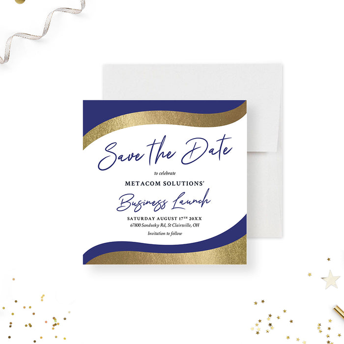
The visual examples above illustrate how a restrained palette can establish a formal corporate tone without requiring complex graphics. Navy, white, metallic-looking gold, charcoal, and muted blue are frequently suitable for business communications because they can create contrast while leaving enough room for typography to remain dominant. The exact colors should still be adjusted to match the organization’s established identity.
Essential Information to Include
The first content block should normally identify the organization and the event. Instead of relying on a generic phrase, use a specific name such as “2027 Annual Leadership Summit,” “Client Appreciation Dinner,” or “Regional Strategy Conference.” Specific naming gives recipients immediate context and also makes the announcement easier to recognize when it appears in an inbox, calendar, or message archive.
The date is the most important information and should be visually prominent. If the event spans several days, show the complete range rather than only the opening day. When the city is already confirmed, including it can be valuable for people who need to plan transportation or accommodation. A venue can be added when sufficiently certain, but an early announcement should avoid presenting unconfirmed logistics as final information.
Timing information depends on how early the communication is being sent. If the exact start time is already established, it can be included. If the program is still evolving, the announcement can simply identify the date and city while stating that the formal invitation will contain additional details. This approach reduces the risk of having to correct early communications because preliminary information changed later.

Contact information should be proportionate to the purpose. A simple internal event may only need a communications contact, while a client-facing conference may benefit from a website or registration destination once those details are confirmed. Avoid adding several competing calls to action to the early announcement. The recipient should understand the next step without being overwhelmed by choices.
Choosing the Right Visual Structure
There are several useful design structures for a business save-the-date. A centered editorial layout places the event name and date in the middle of the page, creating a formal and ceremonial impression. A split layout can place a photograph or illustration on one side and event information on the other. A geometric layout can use blocks, lines, and color fields to create a modern corporate appearance.
Minimalist designs are especially useful when the event itself is prestigious or when the company already has strong branding. In such cases, the template does not need to compete with the brand. A clean background, a controlled type hierarchy, and one strong accent color can provide enough visual distinction. The minimalist business invitation examples from Zazzle demonstrate how large lettering and generous space can create a recognizable announcement without excessive ornamentation.

Script typography can work when the event has a celebratory or hospitality-oriented character, but it should be used carefully for corporate communication. A formal gala or anniversary dinner can support expressive lettering, whereas a technical conference or board meeting usually benefits from a simpler sans-serif or serif system. The objective is not to follow a trend but to make the event feel appropriate to its audience.

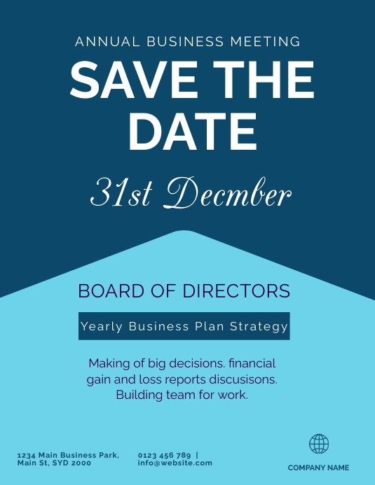
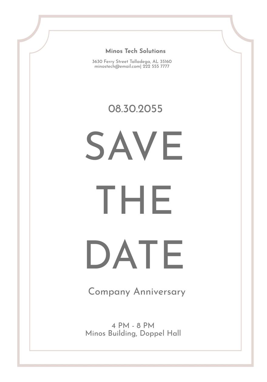
Professional design platforms also demonstrate the value of modular information blocks. The example above separates the event title, descriptive copy, schedule, venue, date, and contact details into distinct visual zones. This makes the design easier to scan and provides a useful model for adapting a template to different business events.
Business Event Types and Appropriate Template Styles
Annual meetings generally benefit from straightforward designs. The audience may already know the organization and understand the purpose of the recurring event, so the communication should emphasize the date, meeting name, location, and any important attendance information. Strong typography and a restrained palette often work better than decorative imagery.
Conferences and executive summits usually need more contextual information because recipients may be traveling from outside the host city. The date range, city, conference title, and broad subject should be easy to locate. A corporate conference design can also establish a visual theme that later carries into signage, presentation slides, email headers, schedules, and other event materials.

Company retreats allow more visual flexibility. A nature-based event can use landscape artwork, mountain imagery, or subdued organic colors while still maintaining corporate typography. The important point is that the visual theme should reinforce the event rather than obscure the date and logistics.

Client appreciation dinners and gala events can support more formal visual treatments. Dark backgrounds, metallic-style accents, elegant serif fonts, and generous spacing can communicate occasion and prestige. The design should nevertheless retain the practical information hierarchy expected from business communication.
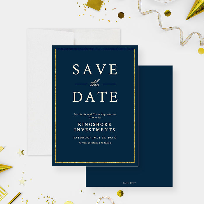
Product launches and grand openings often need a more energetic approach. Strong contrast, a recognizable product or brand image, and a concise event headline can create anticipation while leaving enough room for the date and venue. A launch announcement should avoid revealing information that is not yet confirmed, especially when product specifications or schedules may change.
How to Build the Information Hierarchy
Start with the date as the primary visual anchor. It can be displayed as a large number, a month-and-day combination, or a complete date line. The choice depends on the visual style and the importance of the event. For a conference, a date range may be more useful than a single large numeral. For a dinner, the full date and evening time may be appropriate.
Place the event name close enough to the date that the two pieces of information are understood as a single unit. A common mistake is to make the organization name visually larger than the event itself. Branding matters, but recipients need to know what they are being asked to remember. The organization should support the announcement rather than overpower it.
Secondary details should use smaller typography, lighter visual weight, or a separate information block. Examples include the city, venue, host line, audience description, website, and follow-up statement. The template should make it obvious which information is essential and which information is supplementary.
Branding Without Making the Design Too Busy
Brand consistency is important because an early event announcement is often one of many communications recipients see from the organization. Use the established logo treatment, brand colors, and familiar typefaces where appropriate. If the organization has strict brand guidelines, those rules should take precedence over the decorative elements built into a generic template.
A template should be treated as a structural starting point rather than a finished identity. Replace placeholder content carefully, check the logo’s clear space, and confirm that the contrast remains sufficient after brand colors are introduced. If the brand palette contains several colors, select one dominant color and one accent rather than placing every brand color into the same design.

Consistency also applies to wording. If the company normally uses a formal tone, keep the save-the-date formal. If the brand communicates in a more approachable way, a warmer message may be suitable. What matters is that the language feels like a natural extension of the organization rather than generic event copy.
Designing for Email, Mobile Screens, and Print
A business template may eventually appear in several formats, so the original layout should be designed with flexibility in mind. Text that looks comfortable on a large printed card may become difficult to read when reduced for a phone screen. Keep the main date and event name large enough to remain legible at smaller sizes.
Digital versions should also avoid relying entirely on tiny decorative text. If the recipient needs to zoom in to discover the event date, the hierarchy is not working. A compact design with strong contrast and clear spacing is usually more adaptable than a dense design containing every possible detail.
Print introduces different considerations. Margins, paper dimensions, image resolution, color reproduction, and the physical relationship between the card and envelope can influence the final appearance. Standard invitation proportions such as 5 × 7 inches are common in template libraries, while larger event flyers can use poster-oriented dimensions. The correct format depends on how the communication will actually be distributed.

Practical Wording for Business Events
Good wording is concise and specific. A useful structure begins with an announcement, followed by the organization, event name, date, location, and a brief statement explaining that further details will follow. This avoids the temptation to turn an early announcement into a full invitation.
For an annual meeting, an example could read: “Please reserve Thursday, May 14, 2027, for the Company Annual Meeting in Chicago. Formal invitation and agenda details will follow.” This is a hypothetical example, not a statement about a real event. Its value is the structure: the reader can identify the organization, occasion, date, city, and expected next communication quickly.
For a conference, the wording could emphasize the complete date range and host city. For a retreat, it may mention the destination. For a client dinner, the event title and evening date can take priority. The wording should change with the event rather than forcing every occasion into the same sentence pattern.

Common Mistakes to Avoid
The most common mistake is including too much information too early. An early announcement does not need the complete agenda, speaker biographies, menu, detailed travel instructions, or every registration condition. Overloading the layout reduces the visual importance of the date and can make the recipient overlook the main purpose.
Another mistake is using an attractive design that does not fit the organization. A highly decorative template may be suitable for a celebration but inappropriate for a technical conference or board meeting. Similarly, an extremely conservative layout may feel disconnected from a creative industry event. The design should support the character of the event and audience.
Unconfirmed details are another risk. If the venue, schedule, or event format has not been finalized, avoid presenting those details as fixed. A simple city-level reference or a note that further information will follow can be more professional than issuing corrections later.

Using Templates Across an Event Communication System
A well-designed save-the-date should not exist in isolation. Its colors, typography, spacing, and visual language can establish the design system for later event materials. The same hierarchy can be adapted for the formal invitation, agenda, speaker announcement, reminder message, venue signage, presentation cover, and post-event communication.
This approach reduces visual inconsistency. When every communication uses different colors, fonts, and graphic treatments, recipients may struggle to recognize which messages belong to the same event. A reusable design system makes the event feel more coordinated and professionally managed.
The strongest template therefore acts as a foundation. It should contain enough structure to preserve consistency while leaving enough flexibility for different event names, dates, locations, and audiences. This is particularly useful for organizations that host recurring annual meetings, conferences, customer events, or internal gatherings.

Comparing Layout Approaches
A centered layout is appropriate when the event has a formal character and the date is the primary message. A split layout works well when an event photograph or destination image adds meaningful context. A geometric layout can suit technology, finance, consulting, or innovation events where a contemporary corporate identity is desirable.
Photography should be selected carefully. A conference image can help establish scale and atmosphere, while a destination image can make a retreat feel more tangible. However, the photograph should never reduce the legibility of the event information. Overlaying text on a busy image can create contrast problems, so a solid panel or controlled crop may be necessary.

A horizontal layout can be useful for digital announcements, while a vertical card often feels more natural for printed invitations. The important principle is to select the format according to the distribution channel. Do not simply resize one composition and assume that it will remain effective in every environment.

Practical Solution
Begin by writing the event information before selecting the visual design. Prepare the organization name, exact event title, confirmed date or date range, city, venue if confirmed, and the intended follow-up message. Separate confirmed facts from provisional information. This prevents the design process from encouraging you to publish details simply because the template contains a space for them.
Next, choose a layout based on the event category. Use a clean typographic structure for annual meetings and executive sessions, a destination-oriented design for retreats, a sophisticated treatment for formal dinners, and a more energetic composition for launches or innovation events. Then apply the organization’s established visual identity rather than allowing the template’s default colors to define the brand.
Finally, test the design at the size and channel where recipients will actually see it. Read the design from a distance, inspect it on a smaller screen, check the date first, and confirm that the event name is immediately understandable. Remove anything that competes with those essentials. A successful the date business Template should make the recipient understand the event in a few seconds without requiring additional explanation.

Before publication, conduct a factual review of every visible detail. Check spelling of the organization and event name, confirm the date and date range, verify the city and venue, inspect the contact information, and make sure the follow-up statement matches the actual communication plan. This final review is especially important because a polished design can make incorrect information appear authoritative.

For organizations that create several event communications each year, keep a master content structure separate from the visual design. The content structure defines the fields that must be checked, while the visual template determines how those fields appear. This separation makes it easier to maintain accuracy while adapting the same communication framework to different events.

Additional Design Considerations for Professional Events
Typography deserves special attention because the date is often the single most important visual element. Use a clear typeface for dates and logistical information, and reserve decorative typography for short headings when appropriate. Combining too many typefaces can make an otherwise sophisticated corporate template look inconsistent.
Contrast is equally important. Dark text on a light background and light text on a dark background are straightforward choices, but photographs and textured backgrounds require additional care. If a background competes with the words, introduce a solid information panel or simplify the image rather than reducing the text size.

Whitespace should be treated as a functional part of the design. Empty areas help separate the organization name from the event title, the date from the venue, and the primary message from supporting details. A template with fewer elements can therefore communicate more effectively than one packed with decorative graphics.

For a final visual check, temporarily ignore the smaller text and look only at the large shapes and words. If the event date, event name, and organization identity remain clear, the hierarchy is probably working. If the eye is pulled toward a decorative element instead, adjust the scale, contrast, or placement before publication.
Reference Examples
The reference examples below show how the date business Template can be interpreted across different corporate occasions and visual systems. Some emphasize typography, some use photography or illustration, and others rely almost entirely on spacing and information hierarchy. The most useful comparison is not which design looks most attractive in isolation, but which structure communicates its event purpose most efficiently. A professional business template should make the date easy to recognize, identify the host and occasion, establish an appropriate tone, and leave room for details that genuinely help the recipient understand what is being announced.
These visual references also demonstrate why template selection should be based on communication requirements rather than decoration alone. A conference layout may need a date range and city, while a company anniversary can place greater emphasis on the milestone. A retreat can benefit from destination imagery, while an executive meeting may be stronger with restrained typography. Reviewing several structures before editing one helps clarify the hierarchy, proportion, tone, and information density that best suit the event.

Formal Black and Gold Gala Save-the-Date Preview
Source: Zazzle

Minimalist Corporate Event Invitation Preview
Source: Zazzle

Business Conference Corporate Invitation Preview
Source: Zazzle

Navy Blue and Silver Corporate Save-the-Date Preview
Source: Zazzle

Corporate Invitation White-Background Preview
Source: Zazzle

Business Conference Botanical Preview
Source: Zazzle

Navy Corporate Save-the-Date Botanical Preview
Source: Zazzle

Minimal Corporate Invitation Decorative Preview
Source: Zazzle

Business Conference Card and Envelope Preview
Source: Zazzle
